Remembering the Nintendo GameCube in 2020

Posted 03 May 2020 at 22:39 by Sam C Gittins
Today is the Eighteenth anniversary of the release of the Nintendo GameCube which launched on May 3rd 2002. Last year at N-Europe we celebrated Nintendo's first disc-based 128-Bit console in style which you can check out here in case you missed it and remember that you can always join in with the discussion and celebration on our forum.
In the year of 2020, I thought it would be interesting to look through my own Nintendo GameCube collection which I've built up since the day it launched and while I haven't bought many titles in recent years to add to it; the GC is one of those systems which I'd typically tend not to sell many titles which I own for it due to how much the games have meant to me over the years.
There are many different ways in which physical games can be arranged, while I can see the advantage to putting titles into alphabetical order, especially for consoles which have more uniform spines to the cases; such as with the Nintendo Switch. The covers on Nintendo GameCube games typically feature fantastic artwork which often continues onto the spine of the case, making a lot of titles stand out in a way which is somehow more impactful from a visual standpoint.
If you have plenty of space to store games, then I can see how putting GC games into either alphabetical or release date order could work well, especially if you have either a long shelf or a bookcase to display them all on. Over the years, I've been trying to work out a way to display all of these games using a relatively small amount of space but at the same time in making the games stand out so that they are easy to pick out and play at a moments notice.
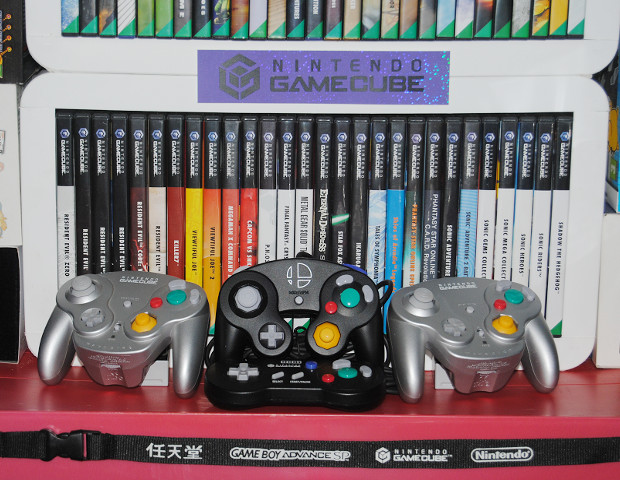
The top First-Party shelf.
Starting right at the beginning with two launch titles, Wave Race: Blue Storm and Luigi's Mansion with plain text sit quite nicely next to the immortal Super Smash Bros. Melee, Super Mario Sunshine stands out a bit more thanks to the blue text offset by the radiating lines plus the original purple case which the game originally launched in.
Both of the Pikmin titles sport a green theme with the first game having a selection of Pikmin on the spine, then Metroid Prime and its follow-up both have iconic logos which are ironically the best part about the entire boxart, StarFox Adventures stands out as the only Rare game to ever grace the GC with a nice dark blue and yellow theme; Chibi-Robo! gives you a solid feel for what to expect from the game due to the logo and some art from the game which is clearly visible.
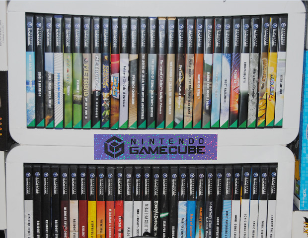
We got two Pokémon titles which continued the Stadium mechanic on, these look nice alongside each other, then all of The Legend of Zelda titles just look aesthetically pleasing thanks to the darker spines plus Twilight Princess seems to suit being in a different gold case; the earthy coloured theme continues with Fire Emblem: Path of Radiance and the mesmerising Paper Mario: The Thousand Year Door, followed by Battalion Wars.
Mario Kart: Double Dash!! featured your typical blue and green with earth tone background, Doshin the Giant with its blue sky really sells this unique game whereas 1080° Avalanche tells what you need to know in that there's snow. F-Zero GX stands out in the best possible way with its neon purple and pink hue, Soul Calibur II is understated as it has two distinct tones, Mario Smash Football has great texture to it while Wario World is gold and gaudy, just as it should be, making the yellow background coupled with colourful logo of Mario Party 4 stand out more... then there's Kirby Air Ride bookending the top shelf.
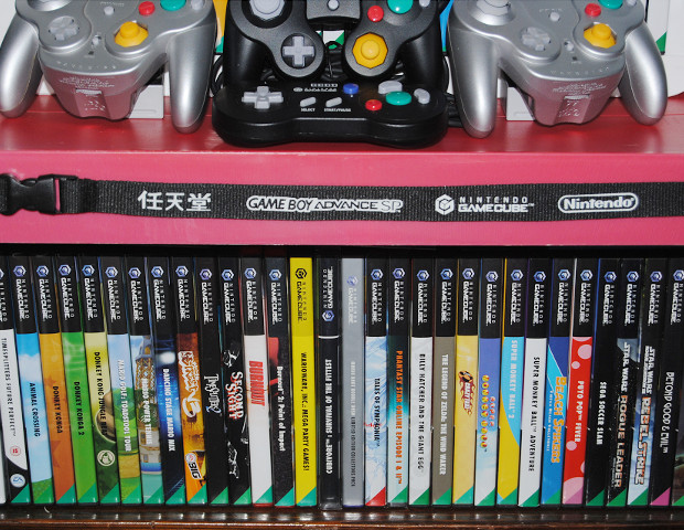
Middle shelf made up of mostly significant Third-Party entries.
The white background with microscopic cells makes Resident Evil Zero stand out more, especially next to the first three games including that iconic REmake, CODE: Veronica's stylish red spine sets up Resident Evil 4 with its lighter background. Continuing the Capcom theme of firey flashes, Killer 7 is blood-red set next to the two Viewtiful Joe titles going through yellow and orange, nicely brought back to a lighter red with Megaman X Command Mission plus the brilliant Beat 'em Up that is Capcom vs SNK 2 EO. (keep rockin' baby!)
Exclusive title P.N.0.3 rounds out the Capcom titles with the white spine featring a few hexagons, leads into the lighter Final Fantasy Crystal Chronicles, leading up to perhaps one of the most iconic third-party games on the system; Metal Gear Solid The Twin Snakes remake made by Silicon Knights, which of course means that the black cover of Eternal Darkness Sanity's Requiem with its iconic logo has to be next to it with Star Fox Assault following up as a Namco title. Ikaruga having a plain black spine with plain white text actually plays nicely into the polarity mechanic of the insanely challenging vertically-scrolling shmup.
Not only a stand-out JRPG but it has a beautiful box, Tales of Symphonia's almost marbled blue and white spine background makes it stand out, orange text on a blue background suits Skies of Arcadia Legends, this is also true for Phantasy Star Online Episode I & II which is probably my most played game on any platform, whereas the card-based Episode III's greyish background with white text suits the underrated but more experimental nature of the game.
Rounding off the Sega section of this second shelf, are a slew of Sonic titles including the reworked Sonic Adventure DX which has a basic black spine whereas launch title Sonic Adventure 2 Battle has a unique hypnotic light blue pattern. Both the Sonic Gems and Mega Collections have a predictably basic white spine, as do Sonic Heroes, Sonic Riders and Shadow the Hedgehog which is one of those titles which needs to be played to be believed, though I wouldn't say it's worth spending too much time on.
Lower shelf of solid titles which don't fit in elsewhere.
The famous Timesplitters sequel doesn't really fit in anywhere thanks to the extra EA logo at the bottom, Animal Crossing is wonderful in its simplicity as it features blue and green, all of the bongo-controller compatible games including two Donkey Konga titles alongside Jungle Beat feature some nice earthy tones with blue and green carrying on with the Mario Golf plus Tennis sequels; Dancing Stage Mario Mix is just there while NBA Street V3 is an EA Sports title which I totally didn't just buy because it had Mario characters in it.
Two shooters of different types in TimeSplitters next to Second Sight which have dark covers, then the absolute classics which are the two Burnout games, gracing the GameCube with alternative red cases (definitely not swapped out from Mario Kart boxes) make the games stand out more just as they surely deserve to. Wario Ware just stands out completely with its completely yellow spine and of course next to it is my only NTSC title which is the beautifully bizarre Cubivore: Survival of the Fittest which deserved a worldwide release but never got one in Europe.
Skipping through some doubles and onto Billy Hatcher and the Giant Egg which has a nice white spine with silverish flourishes and it's a cracking Platformer from Sonic Team as well, Crazy Taxi's logo is iconic against the yellow background, launch title Super Monkey Ball shows off its logo on a blue background while the sequel has a more abstract light blue and yellow spine with basic text; then sadly we have Super Monkey Ball Adventure which is as uninspiring as the game itself which tried to shoehorn in too much, though should get top marks for effort at least.
Beach Spikers has a bold orange logo against three shades of blue, Puyo Pop Fever is red with pink blobs and a purple spine triangle which nearly blends in, Sega Soccer Slam signifies the last title from the developer which doesn't stand out on the shelf despite being a solid title. Most people will recognise the Star Wars Rogue Squadron sequels and if you haven't played them then you probably should while Beyond Good and Evil is a memorable title from an era when it felt like Ubisoft were still really striving for originality; the stylised logo on the plain background seemingly rounding off the row quite nicely, although there is Geist, Bomberman Generations and Harvest Moon - A Wonderful Life on the end which aren't pictured, serving to bookend the collection.
There you have it, thank you for joining me on a visual tour of Nintendo GameCube game spines which make up my current collection, I can only hope that it was interesting enough to warrant as a feature and it's clearly not a last minute, eleventh hour idea of mine made up purely to justify posting pictures of my GC games from last year.
Do you have any favourite boxarts from Nintendo GameCube games? Or perhaps some memories of the console which you'd like to share? Is there a particular title not featured in this collection which you think should be in there?
Let us know your thoughts in the comments section or join in with the discussion on our forum.